        <div class="mb-3">
    <label for="emailInput">Courriel</label>

    <input class="form-control" type="email" id="emailInput" name="testInput" value="" required aria-required="true">
</div>
        <div class="mb-3
     {%- if validation %} has-{{ validation.class }}
     {%- if validation.class === 'danger' %} vd-form-group-{{ validation.class }}
     {%- endif -%}
     {%- endif -%}
    ">
  <label for="{{ id }}"
         {%- if labelHidden %} class="visually-hidden"{% endif -%}
         {%- if labelStyleModifier %} class="{{ labelStyleModifier }}" {%- endif -%}>
    {{- label | safe -}}
      {%- if optional %} <span aria-hidden="true">(facultatif)</span>{% endif -%}
  </label>
  {%- if validation.text -%}
  <div id="{{id}}ErrorMessage" class="invalid-feedback{% if validation.class %} text-{{ validation.class }}{% endif %}">
    {%- if validation.class == "danger" -%}<span class="visually-hidden">Erreur: </span>{%- endif -%}
    {{- validation.text -}}
  </div>
  {%- endif %}
  {% if helpText -%}
  <small
      id="{{ id }}Help"
      class="form-text text-secondary">{{ helpText | safe }}</small>
  {%- endif %}
  <input class="{{ class }}"
         type="{{ type }}"
         id="{{ id }}"
         name="{{ name }}"
         value="{% if value %}{{ value }}{% endif %}"
         {%- if not optional %} required aria-required="true"{% endif %}
         {%- if helpText or validation.class === 'danger' %} aria-describedby="
             {%- if helpText %}{{ id }}Help {% endif -%}
             {%- if validation.class === 'danger' %}{{id}}ErrorMessage{% endif -%}
         "
         {%- endif %}
         {%- if pattern %} pattern="{{ pattern }}"{% endif %}
         {%- if min %} min="{{ min }}"{% endif %}
         {%- if max %} max="{{ max }}"{% endif %}
         {%- if size %} size="{{ size }}"{% endif %}
         {%- if autocomplete %} autocomplete="{{ value }}"{% endif %}
         {%- if placeholder %} placeholder="{{ placeholder }}"{% endif %}
         {%- if disabled %} disabled{% endif%}
         {%- if validation.class === 'danger' %} aria-invalid="true"{% endif %}>
</div>
            {
  "label": "Courriel",
  "id": "emailInput",
  "name": "testInput",
  "type": "email",
  "class": "form-control"
}
-
Content:
@charset 'UTF-8'; .vd-form-group-danger { padding-left: $spacer; border-left: 5px $vd-danger solid; } .form-group { margin-bottom: 16px; select { appearance: auto; } } .form-text { display: block; } input[type="file"] { display: block; } label { margin-bottom: 0.5rem; } legend { font-size: 1.5rem; } - URL: /components/raw/input/_form-group-states.scss
- Filesystem Path: src/components/02-molecules/form/input/_form-group-states.scss
- Size: 330 Bytes
-
Content:
@charset 'UTF-8'; /*** * Remove icon inside the input form. * * 1. Hide the SVG * 2. Override bootstrap padding for the SVG. It makes values invisible on small * inputs * It must be hardcoded. Bootstrap do not have any varaible that can be set * to remove that padding. */ .form-control.is-valid, .was-validated .form-control:valid, .form-control.is-invalid, .was-validated .form-control:invalid { background: none; padding-right: 0.75rem; } - URL: /components/raw/input/input.scss
- Filesystem Path: src/components/02-molecules/form/input/input.scss
- Size: 465 Bytes
-
Content:
- URL: /components/raw/input/numerical-keyboard.png
- Filesystem Path: src/components/02-molecules/form/input/numerical-keyboard.png
- Size: 213.8 KB
- Handle: @input--email
- Variants (14): Default , Optional , Disabled , Help Text , Validation Danger , Validation Success , Email , Number , Password , Date , File , Phone , Phone Error , Help Error
- Preview:
- Filesystem Path: src/components/02-molecules/form/input/input.html
- Referenced by (4): @contact-form, @formulaire-prestation, @formulaire-prestation--step-2, @formulaire-prestation--step-3
A note on the required attribute
You may be aware that there is an HTML5 required attrib- ute. Why aren’t we using this ? Usually it is better to use the HTML5 base semantics rather than the WAI-ARIA extension, but only if vendor (read: browser and screen reader) support is acceptable.
The required attribute is not implemented uniformly across browsers. It also tends to invoke an undesirable feature: marking empty required fields as invalid from the outset. For our purposes this is rather verbose and aggressive.
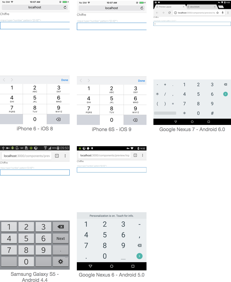
Triggering the numerical keyboard
The only way to trigger the numerical keyboard on mobile is to use the following input:
<input type="number" pattern="[0-9]*" />
autocomplete attribute
This attribute indicates whether the value of the control can be automatically completed by the browser. It may be a good practice to use this attribute with known data, such as a form where the user must enter his or her contact information.
More inforamtion in Autofilling form controls: the autocomplete attribute.
<form action="" autocomplete="on">
  <label for="name">Nom</label>
  <input id="name" type="text" autocomplete="name" />

  <label for="email">Email</label>
  <input id="email" type="email" autocomplete="email" />

  <label for="phone">Téléphone</label>
  <input id="phone" type="tel" autocomplete="tel" />

  <label for="postal-code">NPA</label>
  <input id="postal-code" type="text" autocomplete="postal-code" />

  <label for="password">Password</label>
  <input id="password" type="password" autocomplete="new-password" />

  <input type="submit" />

</form>